Network Rail required a review and update of their Wayfinding Design Guidelines, originally published in 2000.
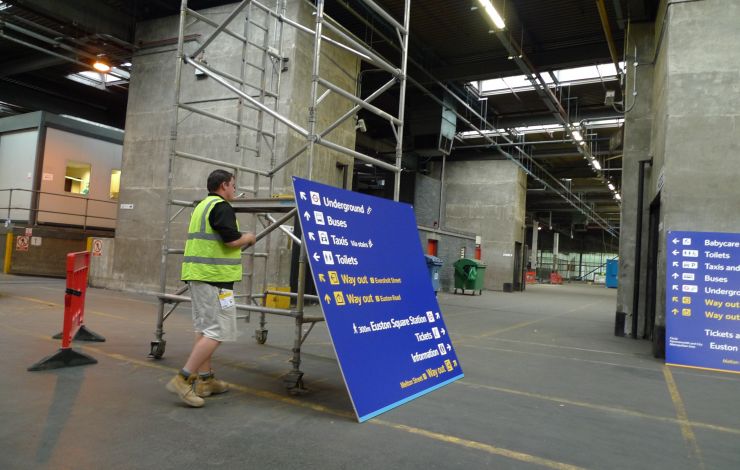
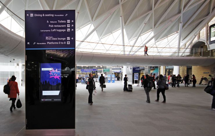
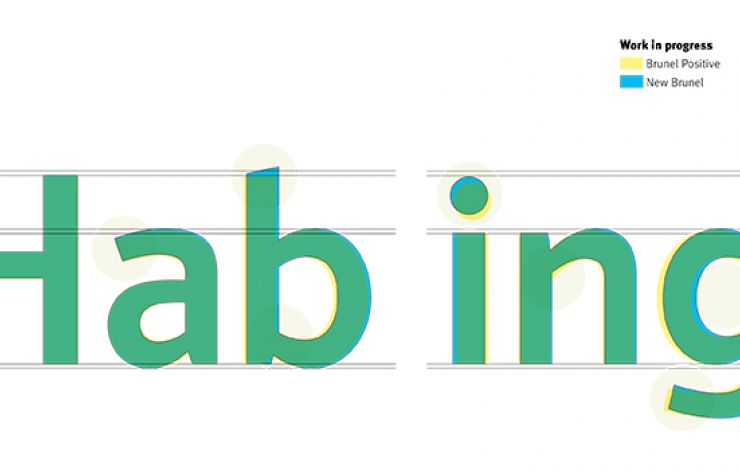
In 2012, Steer was commissioned to develop a single volume guidelines document with clear and simple instructions on layout, positioning and information hierarchy to support either full or incremental wayfinding updates by individual stations. The update also included a refresh of all graphic elements taking account of the new Network Rail brand; creation of a new, digital Brunel typeface that retains the attributes and characteristics of the original, but has stylistic-formal optimization and improved typographic controls; and a new digital icon suite to rationalise and remove duplication to simplify application and improve legibility.
Design intent drawings were created for all products to improve consistency across manufacturers and standardise installations.
By adopting principles of accessible and legible design for passenger information and wayfinding from the outset the new guidelines are helping to deliver stations that are easy to use, require minimal signage and are well integrated with their surroundings.


